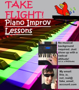
Over a couple months now, I have been imagining what starting my own piano-teaching business would be like. Part of this has been picturing how the poster for advertising this business would look. Therefore, when I heard about this Graphic Design Project, I already had a well-developed idea for it. What I have posted here is the manifestation of that long-held idea, my poster for piano improvisation lessons.
Since I have thought over this poster’s design during my daily life (without sitting down to research things), there are not many individual inspirations I can name. Most of the design elements popped into my head naturally. However, I can at least name where I took the concept for my theoretical business from. It is from Chopin Academy, a music school I took most of my private piano lessons from. I have the link to this school’s website below.
While making the poster, I wanted to portray a message of “having fun” and “being laid back” in the unified whole. One of the most important steps for doing this was to use an appropriate mix of colors. To establish my message’s figurative background of fun and excitement, I used intense colors in the actual background. The fact that they cover a keyboard is intentional, since this way people can interpret the keyboard as the source of the fun.
I did not want the colors to be too exciting, though. In addition to feeling fun, I wanted the poster to feel relaxed. That is why each background color is analogous to the one next to it, so that there is no alarming contrast between them. That is also why I gave the gray boxes the color they have. I wanted these boxes to pop from the background, but I did not want them to do so in a surprising way by using a color more vivid than gray.
Speaking of the boxes, I designed the two lower-right ones with Gestalt Theory in mind. I aimed to associate them with one another by making them very similar. They have the same shape, same color, and same style of text on them; and they are both are placed near photos with dull color schemes. I also associated them by putting them in close proximity. The point in all this is to make people view these boxes as a single item separate from the rest of the poster. After all, I need them to seem separate from everything else, since I have important info on them I want people to easily notice.
Three of my images are simply photos I took in my bedroom. The fourth image is a cartoon I designed. I thought my business could be more appealing if it had a brightly-colored mascot, so I drew a character I call “Bird Guy” who could fill that role. I then photographed him, put him in Photoshop, and edited him so his colors would look more impressive.
I did not have a hard time finding images, but I did have a hard time using Photoshop. It took me hours to figure out how to make the background’s rainbow effect. Through trial and error, I eventually found a process for this. I sliced up the keyboard image with the “Polygonal Lasso Tool,” then I made each slice into its own layer through “Layer Via Copy.” I made six “Hue/Saturation” layers, then I gave each its own color. Lastly, I attached each “Hue/Saturation” layer to a keyboard slice by making them “Layer Masks.” For certain, making your vision a reality in Photoshop is difficult as a beginner. My advice to other beginners would be to set aside enough time for figuring out how to accomplish what you want.

Hi Bailey ! Your first draft for this project is very nice. Starting your own piano-teaching business sounds like fun and it sounds like you are very passionate about it. In your first draft a strong part of your project would be lots of visual ideas and options. It allows me to see lots of different images you photoshopped. The piano is what catches my eyes with the different colors on it. I just have a few recommendations for you that might help you out. First off, the grey at the top kind of throws me off, if possible you could mesh the piano so it is all of the page instead of being cut off with the grey. Layering may be able to help you in that way. Another idea I had was for your text, by changing your font text, something that would make it a little more official. I can see where you used the lasso tool and hue/saturation, very well done.
LikeLike
Bailey, I have always wanted to learn to play the piano and it is exciting that you are working on a dream of yours! I am super impressed by the cartoon logo you designed and created. I also enjoyed the colors on the piano, I think it did add a fun flare yet relaxed design to your project like you said. A suggestion for improvement could be making the black keys of the piano fully black. I think it could provide more detail for your final project. Since you struggled with this part of the project I bet the TA could help you figure it out. You did a great job with the two lower photos and incorporating the Gestalt Theory. Like Chelsea said, the grey at the top threw me off as well. Maybe you could add another picture up at the top. Overall, I was impressed with all the work you put into this project especially the cartoon.
LikeLike
So far, only one person has commented on my post. Despite that, I already feel like I have been given some valuable critiques. The person who commented, Chelsea Goehring, suggested that I take off the gray box at the top. I agree, since it meshes poorly with the colorful image below it. Chelsea also suggested that I change the font of my text so it looks a bit more professional. I am considering this, but I am not sure about doing that yet since I like the playful look of it.
There have been a couple other things bothering me ever since I finished the draft. One is that “Bird Jim’s” keyboard does not look very distinct from the background. After I remove the gray at the top, I know “Bird Bobby” will look even less distinct. I think my solution will be to make “Bird Gordon” his own background, probably a box that will be colored uniquely.
Another thing bothering me is the color of the boxes in the bottom right. Like I said before, the gray meshes poorly. I think I will change the color to something more vivid. That may make the poster feel less laid-back than I want it, but it will probably look more pleasing to the eye.
The biggest challenge I will have in my final draft is figuring out what to replace the box at the top with. Chelsea recommends extending the keyboard background upward, though I do not know if doing so will let my title stick out well.
LikeLike
I like the creativity on your graphic design post. The drawing that you put was pretty cool! I like how you included that and you are the first person to include a hand-drawn image. I do agree with Chelsea and think that maybe instead of the plain grey boxes you can add a popping effect to draw the audience to the writing. You can also possibly change the color of the title box on the top instead of gray. I really like the background that you chose because its popping color. It really draws the eye.
LikeLike